Imaging Cantopop

Design and Performativity
B-side

Designing an Experience

Cantopop reached its peak popularity at a time of technological change within the music industry, and designers had to adapt. Before the age of iTunes or YouTube, much thought was given to the design of 12-inch vinyls. Packed with surprises and eye-catching extras, albums were designed to be far more than a case for a record. This remained true through the early 1990s, when smaller-format CDs added new constraints, but also presented new challenges and opportunities for designers. Physical albums were expressive devices that signified the listener’s ownership of the music and depth of aesthetic engagement with the performers’ aura and performance.

Alan Chan’s attempt to reflect the spirit of the epic documentary The Silk Road extended beyond the soundtrack album’s sleeve design. Within the three-panel gatefold sleeve that folds out to reveal a longer dessert scene is a set of six collectible postcards, shot with an earthy tone and minimal composition, depicting key sites and everyday scenes along the Silk Road.

Interior of vinyl album Silk Road Tour: Music Collection. Once opened, the horizontal three-page spread shows a single file of travellers with camels, with the sky transitioning from a muted green to brownish orange. Another page folds out vertically from the middle, showing the back of Kitaro, who is performing on stage.

Alan Chan. Vinyl album cover for various artists, Silk Road Tour: Music Collection, 1983. M+, Hong Kong. © Capital Artists Ltd. 

Alan Chan. Vinyl album cover for various artists, Silk Road Tour: Music Collection, 1983. M+, Hong Kong. © Capital Artists Ltd. 

Just a few years after Chinese Mainland opened to visitors, Chan commissioned travel photographer Jacky Yip to capture the vast and diverse cultures and topography along the ancient trade route, including majestic Maijishan cave shrines in Gansu and a corn harvesting scene before a hut in Wulumuqi.

Square postcard gifted with the Silk Road Tour: Music Collection vinyl album. Within the white frame is a photograph of the Maijishan Grottoes underneath a sky with a dense layer of clouds.
Square postcard gifted with the Silk Road Tour: Music Collection vinyl album. Within the white frame is a photograph of adults and children amidst rows of harvested corn piles.
Square postcard gifted with the Silk Road Tour: Music Collection vinyl album. Within the white frame is a photograph of the Mingsha Mountain with the Crescent Moon Spring in the middle.
Square postcard gifted with the Silk Road Tour: Music Collection vinyl album. Within the white frame is a photograph of the defensive wall of the Jiayu Pass. There is a visible shadow casted on the bottom right corner of the wall.
Square postcard gifted with the Silk Road Tour: Music Collection vinyl album. Within the white frame is a morning photograph of the Jiaohe Ruins amidst tree groves.
Square postcard gifted with the Silk Road Tour: Music Collection vinyl album, photographed near Tian Shan. Within the white frame is a photograph of a mother holding a baby and three other children, all standing in front of a Mongolian yurt in descending height order.

Alan Chan. Vinyl album cover for various artists, Silk Road Tour: Music Collection, 1983. M+, Hong Kong. © Capital Artists Ltd. 

Alan Chan. Vinyl album cover for various artists, Silk Road Tour: Music Collection, 1983. M+, Hong Kong. © Capital Artists Ltd. 

Detail of a square postcard gifted with the Silk Road Tour: Music Collection vinyl album, featuring a morning photograph of the Jiaohe Ruins amidst tree groves.
Detail of a square postcard gifted with the Silk Road Tour: Music Collection vinyl album, featuring a photograph of the Mingsha Mountain with the Crescent Moon Spring in the middle.
Detail of a postcard gifted with the Silk Road Tour: Music Collection vinyl album, featuring a photograph of the Maijishan Grottoes beneath a sky with a dense layer of clouds.

Though the subject matter was more personal, a similar ambition in the design of album packaging is evident in I Want: Deanie Ip. This was the first album issued by Black & White Records, founded by Tina Liu. Appropriately enough, Liu used black-and-white as the album’s theme colours, posing Deanie Ip on a Memphis-inspired pebbled leather sofa that contrasts with the bold red font of the album’s Chinese title.

Cover of Deanie Ip’s vinyl album I Want, with the horizontal title in red at the top. The singer looks into the camera while sitting on a sofa with a black-and-white pattern.
12-inch vinyl record of Deanie Ip’s album I Want. The horizontal title in red is at the top and the song list in black is on the record label. The bottom left has the same black-and-white pattern as the album cover.

Tina Liu. Vinyl album cover for Deanie Ip, I Want, 1985. © Black & White Records Ltd. 

Tina Liu. Vinyl album cover for Deanie Ip, I Want, 1985. © Black & White Records Ltd. 

Cover of Deanie Ip’s vinyl album I Want, with the horizontal title in red at the top. The singer looks into the camera while sitting on a sofa with a black-and-white pattern., image

To enhance the experience of reading through the lyrics, Liu printed parts of the lyrics in white on a transparency.

Lyric sheet of Deanie Ip’s vinyl album I Want, which is divided into ‘black’ and ‘white’ sides. The page has a black-and-white pattern. The song titles in red, lyrics in white, and other album details are contained within the black parts.

Tina Liu. Vinyl album cover for Deanie Ip, I Want, 1985. © Black & White Records Ltd. 

Tina Liu. Vinyl album cover for Deanie Ip, I Want, 1985. © Black & White Records Ltd. 

Lyric sheet of Deanie Ip’s vinyl album I Want, which is divided into ‘black’ and ‘white’ sides. The page has a black-and-white pattern. The song titles in red, lyrics in white, and other album details are contained within the black parts., image

When placed against the back of the album sleeve, which was printed with keywords in red such as ‘life’, ‘pain’, ‘struggle’, and ‘gentleness’, it presents a complete reading experience of the song titles and lyrics, while emphasising certain emotive elements of Ip’s songs.

Back cover of Deanie Ip’s vinyl album I Want, which is divided into ‘black’ and ‘white’ sides. The page has a black-and-white pattern. The song titles and some keywords of the album are in a red font, contained within the black parts.

Tina Liu. Vinyl album cover for Deanie Ip, I Want, 1985. © Black & White Records Ltd. 

Tina Liu. Vinyl album cover for Deanie Ip, I Want, 1985. © Black & White Records Ltd. 

Back cover of Deanie Ip’s vinyl album I Want, which is divided into ‘black’ and ‘white’ sides. The page has a black-and-white pattern. The song titles and some keywords of the album are in a red font, contained within the black parts., image
Transparent song-listing sheet for the back of an album cover., image

Basil Pao’s design for Tai Chi’s Forbidden Love reflects an understanding of an album as a conceptual object. The imagery departs from the band’s previous albums, whose covers featured standard shots of the seven-member band. Pao instead chose to portray them with a yin-yang symbol, which alludes to the band’s name.

Back cover of Tai Chi’s vinyl album Forbidden Zone. A tai chi symbol takes up the entire cover with a grey background visible on the four corners. The song list is laid out on the white and black parts of the symbol, with the seven band members lined up along the central curved line. Each member has a red, orange, yellow, green, light blue, blue, and purple outline respectively.

Basil Pao. Vinyl album cover for Tai Chi, Forbidden Zone, 1987. M+, Hong Kong. © Warner Music Hong Kong Ltd. 

Basil Pao. Vinyl album cover for Tai Chi, Forbidden Zone, 1987. M+, Hong Kong. © Warner Music Hong Kong Ltd. 

Back cover of Tai Chi’s vinyl album Forbidden Zone. A tai chi symbol takes up the entire cover with a grey background visible on the four corners. The song list is laid out on the white and black parts of the symbol, with the seven band members lined up along the central curved line. Each member has a red, orange, yellow, green, light blue, blue, and purple outline respectively., image

Pao photographed an Asian woman in white silk and a Caucasian woman in black silk (referencing René Magritte's painting The Lovers) positioned like the interlocking spirals of the Taoist t’ai chi symbol for yin and yang. The cover image appears like a wheel as one rotates the album sleeve.

Cover of Tai Chi’s vinyl album Forbidden Zone. Two female heads, covered by white and black veils respectively, are positioned in a way that resembles the tai chi symbol. The back of each head, looking outward, rests on the other figure’s left shoulder. The title is visible on the top left and bottom right corners.

Basil Pao. Vinyl album cover for Tai Chi, Forbidden Zone, 1987. M+, Hong Kong. © Warner Music Hong Kong Ltd. 

Basil Pao. Vinyl album cover for Tai Chi, Forbidden Zone, 1987. M+, Hong Kong. © Warner Music Hong Kong Ltd. 

Cover of Tai Chi’s vinyl album Forbidden Zone. Two female heads, covered by white and black veils respectively, are positioned in a way that resembles the tai chi symbol. The back of each head, looking outward, rests on the other figure’s left shoulder. The title is visible on the top left and bottom right corners., image

While Hot Summer is one of the many albums Alan Chan designed for Leslie Cheung, it was perhaps the most ambitious. Touted as Hong Kong’s first 3D album packaging, the cover imagery features a close-up of Cheung by the beach in front of a sky filled with stereoscopic images of free-floating astronauts and asteroids. A T-Rex makes an appearance on the lyric sheet. These images, which look like they were produced with digital precision, were in fact layers of photographic images and line art hand-rendered in offset red and blue and shifted at two different angles to give an illusion of depth when seen through the 3D glasses found in the album sleeve. The album was a hit amongst teens who loved experiencing their heart-throb pop out of a dream-like galactic beach scene.

Cover of Leslie Cheung’s vinyl album Hot Summer, containing images viewable with 3D glasses. The vertical title in yellow is on the left. The background shows a rainbow, astronaut, meteorite, and clouds in the blue sky, with an island at the centre beneath. Positioned at bottom right, Cheung wears a black tank top, looking into the camera with his right hand next to his mouth.
Back cover of Leslie Cheung’s vinyl album Hot Summer. The pink and purple background has images viewable with 3D glasses, including a dinosaur, clock, astronauts, and meteorites. Positioned at the bottom right, Cheung wears a long-sleeved black top, pink fabric, and sunglasses, resting the back of his head on his hands.
Two-page spread in the lyric booklet of Leslie Cheung’s vinyl album Hot Summer, containing images viewable with 3D glasses. The left page has the singer resting his right hand on his head, with a background of blue skies, white clouds, and a rainbow. The right page has the lyrics. A series of astronauts appears across the spread.
Two-page spread in the lyric booklet of Leslie Cheung’s vinyl album Hot Summer, containing images viewable with 3D glasses. The left page has lyrics on its upper half and a dinosaur at the bottom left corner. The right page has Cheung looking into the camera with his right fist placed next to his mouth.
Interior of Leslie Cheung’s vinyl album Hot Summer, with a background of waves splashing onto a rocky shore. A pair of 3D glasses is attached to the page, with the left circular lens in green and the right rectangular lens in red.

Alan Chan. Vinyl album cover for Leslie Cheung, Hot Summer, 1988. M+, Hong Kong. Gift of Alan Chan, 2020. © Universal Music Ltd.

Alan Chan. Vinyl album cover for Leslie Cheung, Hot Summer, 1988. M+, Hong Kong. Gift of Alan Chan, 2020. © Universal Music Ltd.

Two-page spread in the lyric booklet of Leslie Cheung’s vinyl album Hot Summer, containing images viewable with 3D glasses. The left page has the singer resting his right hand on his head, with a background of blue skies, white clouds, and a rainbow. The right page has the lyrics. A series of astronauts appears across the spread.
Two-page spread in the lyric booklet of Leslie Cheung’s vinyl album Hot Summer, containing images viewable with 3D glasses. The left page has lyrics on its upper half and a dinosaur at the bottom left corner. The right page has Cheung looking into the camera with his right fist placed next to his mouth.

For his first CD album design, Alan Chan had to counter the reduction of cover art from a 12-inch to a 5-inch square while reflecting the bold scope of Lo Ta-yu’s politically inspired lyrics and reflections on Hong Kong’s handover from Britain to China.

Cover of CD album Music Factory II, containing three horizontal bands with sections taken from different portraits to form a full portrait. The top part reveals a forehead with a dark red scar at top. The middle part has a pair of eyes and nose. The bottom has a smiling mouth with a mole on its bottom right. The repeated vertical Chinese album title is placed on the left and right corners, one in black and the other in white.
Back cover of CD album Music Factory II. Portraits of different politicians are deconstructed into three horizontal bands and reassembled into new portraits, some including a red band with information of a song title and its singer.

Alan Chan. Album cover for Lo Ta-yu, Music Factory II: Capital, 1992. M+, Hong Kong. Gift of Alan Chan, 2020. © Rock Records Co., Ltd.

Alan Chan. Album cover for Lo Ta-yu, Music Factory II: Capital, 1992. M+, Hong Kong. Gift of Alan Chan, 2020. © Rock Records Co., Ltd.

Chan maximised the visuality of the lyric booklet by having each page composed of three distinct strips. Each strip is printed with one third of a portrait of a famous figure who symbolises colonial, capitalist, or communist systems, including Queen Elizabeth II, Deng Xiaoping, and Martin Lee.

By flipping the strips, readers could mischievously mix and match various parts of the portraits to create eighteen facial permutations that embodied the changing colours of politics and reflected the ability of pop albums to convey layered meanings and complex emotions.

Three-page spread within the CD album Music Factory II. The middle page has a black background and red font. The left and right pages have portraits formed by combining three horizontal bands taken from different portraits.
Three-page spread within the CD album Music Factory II. All pages have portraits formed by combining three horizontal bands taken from different portraits.
Three-page spread within the CD album Music Factory II. All pages have portraits formed by a collage of three horizontal bands taken from different portraits.

Alan Chan. Album cover for Lo Ta-yu, Music Factory II: Capital, 1992. M+, Hong Kong. Gift of Alan Chan, 2020. © Rock Records Co., Ltd.

Alan Chan. Album cover for Lo Ta-yu, Music Factory II: Capital, 1992. M+, Hong Kong. Gift of Alan Chan, 2020. © Rock Records Co., Ltd.

For his first CD album design, See for Cass by Cass Phang, Wing Shya challenged the already stale conventions of CD jewel case packaging. Rather than trying to replicate the luxurious qualities of an LP, he created a CD case with a single piece of cardboard. It was a ten-page accordion folding mechanism that had a diagonal fold in the middle to contain the CD and lyric sheet. When turned to the right, it revealed Phang’s portraits and airbrushed clouds and crosses.
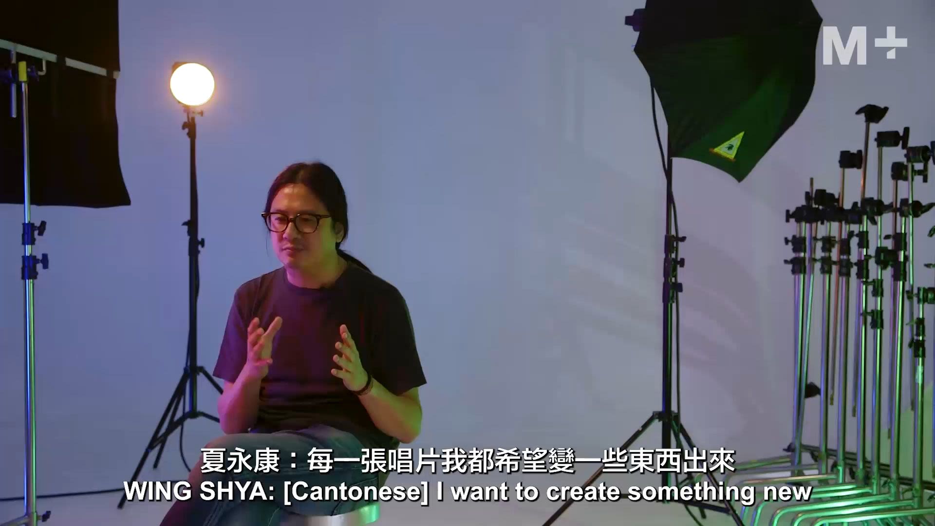
Wing Shya discusses his approach to design and experimentation

Wing Shya discusses his approach to design and experimentation

I want to create something new each time . . . I don't want to follow a conventional path. I want to explore something new.”
Wing Shya

View of Cass Pang’s CD album See for Cass opened into a five-page spread. The top page shows the singer standing in front of a yellowish orange background. She wears a black outfit and looks into the camera. The middle two pages have a coral background, decorated with the letter ‘c’ in wine red and white beaded crosses. The bottom two pages have blue skies as the background, with the singer blending into the background.

Wing Shya, Michael Lau and Claudia Chui. Album cover for Cass Phang, See for Cass, 1993. © Universal Music Ltd. 

Wing Shya, Michael Lau and Claudia Chui. Album cover for Cass Phang, See for Cass, 1993. © Universal Music Ltd. 

Front and back covers of Cass Pang’s CD album See for Cass. The two-page spread has blue skies as the background. The right page has the singer blending into the background and the title placed at the lower centre. The left has the song list and album details in a small black font at the lower half.
Interior view of Cass Pang’s CD album See for Cass. The two-page spread has a coral background, decorated with four circular stamps of the letter ‘c’ in wine red and nine white beaded crosses.

True to his unorthodox role as ‘master appropriator’, Jan Lamb made reference to his childhood obsession with Star Trek through the packaging of his first solo album Hard Beat, created in in collaboration with Wing Shya (co-founder of Shya-la-la) and Michael Lau (now famous urban toy designer).

Front of the packaging of Jan Lamb’s CD album Hard Beat, referencing sci-fi media franchise Star Trek. The jewel case and disc include illustrations of the singer as Spock and the band as the Starfleet members respectively. The rectangular packaging has the title on top, with the case at the middle and the disc at the bottom.

A metallic silver-printed booklet features Lamb-as-Captain Spock on the cover with his hand-held phaser weapon and a CD printed with a Starfleet look-alike and Lamb with his Vulcan salute. Reminiscent of how action figure toys were sold, the album’s various components were packed in a plastic blister on cardboard backing.

Front and back of the insert in Jan Lamb’s CD album Hard Beat, with a silver background. On the right page, the singer is illustrated as Spock, holding a gun. On the left page, there is a small badge at the centre with a black-and-white portrait of the singer as Spock.
Back of a flyer accompanying Jan Lamb’s CD album Hard Beat. It features an English comic strip based on Star Trek.
A poster from Jan Lamb’s CD album Hard Beat, referencing sci-fi media franchise Star Trek.

The package included an A3 fold-out poster of Lamb’s crew on the front and lyric sheet on the back; a flyer that entitled the buyer to a free Hard Beat t-shirt; and a flyer of a fictitious concert to be held on 1 July, 1997, on the front and a comic strip on the back narrating the fleet’s determination to hold the concert with reason being (in deliberately broken English) ‘horse still running, people still dancing!’.

Front of poster accompanying Jan Lamb’s CD album Hard Beat. It features a black-and-white photo of the singer and band members as characters from Star Trek.
Back of poster accompanying Jan Lamb’s CD album Hard Beat, with the lyrics of the songs. The background is a silver illustration of the singer as Spock from Star Trek.
Front of a flyer accompanying Jan Lamb’s CD album Hard Beat. It promotes a fictitious concert being held on 1 July 1997. On the right is a portrait of the singer as Spock from Star Trek. On the bottom left are portraits of the band members as part of Starfleet.
Flyer accompanying Jan Lamb’s CD album Hard Beat. It enables the buyer to exchange for a free black t-shirt that has an illustration of the singer as Spock from Star Trek, holding a gun.

Launched just two months before Hong Kong’s handover, Hard Beat’s fantastical sensibility and retro-futuristic aesthetic seemed like a tongue-in-cheek invitation to embrace a continuity in an unknown future.

Back of packaging of Jan Lamb’s CD album Hard Beat, with a full body illustration of the singer as Spock from Star Trek. Surrounded by perforated dots, the character can be easily removed and turned into a standing figure with the accompanying paper stands.

All Hard Beat images: Shya-la-la, Wing Shya,  Jan Lamb and Michael Lau. Album cover for Jan Lamb, Hard Beat, 1997. © Universal Music Ltd. 

All Hard Beat images: Shya-la-la, Wing Shya,  Jan Lamb and Michael Lau. Album cover for Jan Lamb, Hard Beat, 1997. © Universal Music Ltd. 

A poster from Jan Lamb’s CD album Hard Beat, referencing sci-fi media franchise Star Trek.
Back of a flyer accompanying Jan Lamb’s CD album Hard Beat. It features an English comic strip based on Star Trek.
Front of a flyer accompanying Jan Lamb’s CD album Hard Beat. It promotes a fictitious concert being held on 1 July 1997. On the right is a portrait of the singer as Spock from Star Trek. On the bottom left are portraits of the band members as part of Starfleet.

An Inter-Disciplinary Process

Creative professionals from various disciplines thrived in the Hong Kong music industry’s image-making enterprise. Professional roles could be fluid: fashion editors and costume designers could serve as art directors, while trained graphic designers experimented with photography and set design. Porous boundaries between the professional and amateur, and an industry-wide emphasis on collaborative authorship led to experimentation with new tools, new career paths, and, above all, new graphic possibilities.

As art director at Atlantic Records and Warner Bro. Records in the United States, Basil Pao had world-class resources like the latest in dye-transfer technology or working with photographers like Richard Avedon. Upon returning to Hong Kong in the 1980s, Pao had to be hands-on in all aspects of graphic production.

Cover of George Lam’s vinyl album Love Fever. The hand-painted background depicts orange flames against a dark blue sky. The singer dressed in white is at the centre, resting his head on his right hand over the door of a convertible, looking into the camera. Positioned off-centre towards the left at the top, the horizontal title is rendered in four different typefaces.

Basil Pao. Vinyl album cover for George Lam, Love Fever, 1984. M+, Hong Kong. © Warner Music Hong Kong Ltd. 

Basil Pao. Vinyl album cover for George Lam, Love Fever, 1984. M+, Hong Kong. © Warner Music Hong Kong Ltd. 

To express the fiery passion of George Lam’s Love Fever album, Pao used his training in graphic design and illustration as well as his self-taught photography skills to print Lam’s photograph on watercolour paper and render flames against the sky using photo oil and chalk.

Back cover of George Lam’s vinyl album Love Fever. Taking up most of the composition is a side portrait of the singer in a red top, holding a microphone that is on fire. On the bottom left is the song list.

Basil Pao. Vinyl album cover for George Lam, Lam 85’ Special, 1985. M+, Hong Kong. © Warner Music Hong Kong Ltd.  
Basil Pao. Vinyl album cover for George Lam, Lam 85’ Special, 1985. M+, Hong Kong. © Warner Music Hong Kong Ltd.  

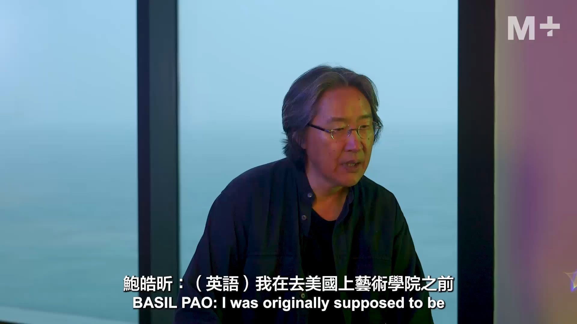
Basil Pao reflects on his student days and the motivation that drove him to pursue a career in album cover design

Basil Pao reflects on his student days and the motivation that drove him to pursue a career in album cover design

. . . the album covers were . . . the pop art of the time. Something new, something extraordinary happens with every release, some extraordinary piece of work comes out on that little square.”
Basil Pao

At the time, concerts were more lucrative than record sales for Cantopop stars and record companies. For the Lam 85’ Live concert poster and the related Lam 85’ Special album cover, Pao utilised a larger budget to produce a composite image of Lam’s studio shot with a photo of a gas flare at an oil well, which Pao purchased from an industrial photographer. This was done using high-quality photo-retouching machine only available in Tokyo at the time. When asked if this could be done in an easier way, Pao said, ‘For a concert, people are going to see him live. So the whole fat siu (發燒) (‘fever’ or ‘burning’ in Cantonese) has to be physical. It can’t just be a symbolic representation of fever.’

Starting from 1981, Tina Liu honed a meticulous approach to fashion styling and editorial design at City Magazine, the first local monthly magazine on art and culture that set a new standard for the industry since its founding in 1976. She applied these skills to Deanie Ip’s album You Left Me Here. A sense of emptiness pervades the album art, which is striking in its understatement. Swathed in a sackcloth-like Comme des Garçons dress, Ip stares forlornly from the corner of the inner album sleeve. The lyric booklet hangs on an elastic string attached to the double-jacket gatefold sleeve. The album’s pared-down simplicity and khaki-black contrast, with monochromatic studio shots printed on coarse brown and black paper, emphasised the title track’s theme of abandonment.

Tina Liu talks about the local Hong Kong creative scene in the 1980s and how her editorial background influenced her album cover designs

Tina Liu talks about the local Hong Kong creative scene in the 1980s and how her editorial background influenced her album cover designs

It is not just about taking a nice picture, there need to be messages . . . that connects the artist, music, and album cover and brings that connection to life. From the perspective of an editor, it is a conceptual process.”
Tina Liu
Cover of Deanie Ip’s vinyl album You Left Me Here. The singer’s frontal portrait takes up most of the composition, her eyes looking into the camera. The vertical Chinese title in gold is printed on the top centre.
Back cover of Deanie Ip’s vinyl album You Left Me Here. On the left is a full side portrait of the singer in a grey outfit. The vertical Chinese title and song list in gold is on the top right.
Interior of Deanie Ip’s vinyl album You Left Me Here, with the accompanying lyrics booklet at the centre. The inner pages of the booklet mainly have a black background, and the lyrics and images have a gold tone.

Tina Liu. Vinyl album cover for Deanie Ip, You Left Me Here, 1984. M+, Hong Kong. © Wing Hang Record Trading Co., Ltd. 

Tina Liu. Vinyl album cover for Deanie Ip, You Left Me Here, 1984. M+, Hong Kong. © Wing Hang Record Trading Co., Ltd. 

For the album Thousand Suns Liu transformed the cosmopolitan sensuality that Deanie Ip expressed in previous albums into an iconic representation of a grand dame. Liu interpreted the sun as a concentration of warmth and richness emanating from the intricately embroidered and patterned temple tapestry, which Liu tailored into Ip’s top. The fabric was photographed and printed to encircle Ip on the die-cut sleeve. Liu’s all-encompassing art direction was evident in Ip’s expressive make-up and hairstyling, specially-selected gold enamel accessories, choreographed posture, and the album title set in Skinny Gold (瘦金體) calligraphic font—known to be invented by Emperor Song to resemble twisted gold filament.

Cover of Deanie Ip’s vinyl album Thousand Suns. Densely populated peonies fill a golden yellow background, forming an outer frame that extends beyond the album’s frame as an extra foldable flap on the left. At the centre is a half body portrait of the singer with a ponytail on a black background. She wears a top with the same peony pattern as the cover. Album title is on top right.
Back cover of Deanie Ip’s vinyl album Thousand Suns. Densely populated peonies on a golden yellow background form an outer frame, which surrounds the lyrics in gold on a black background. The extended foldable flap, on the right, also has a black background. It has a half body portrait of the singer looking toward the left at the bottom.

Tina Liu. Vinyl album cover for Deanie Ip, Thousand Suns, 1986. M+, Hong Kong. © Black & White Records Ltd. 

Tina Liu. Vinyl album cover for Deanie Ip, Thousand Suns, 1986. M+, Hong Kong. © Black & White Records Ltd. 

Designer Alan Chan utilised new technology to create a graphic style as flamboyant as Elisa Chan’s personal style. It would be Chan’s only album design resulting from his experimentation with the newly marketed colour copy machine, composed of portraits of Chan’s whimsical expressions that appear to be digitally processed and crudely produced. He moved original photographs of Chan on the glass bed during scanning to generate smears and blurs, played with the colour balance and contrast buttons to adjust the hues and tones, and experimented with running the same image through the copier multiple times to superimpose different images on the same page. The result is a grid of portraits in flat, vibrant blocks of pink, purple, and black, complete with Warhol-esque blots and off-register effects.

Cover of Elisa Chan’s self-titled vinyl album. It has a 3 x 3 layout of nine portraits of the singer showing different expressions on a purple background. She wears a pink top and black gloves.
Back cover of Elisa Chan’s self-titled vinyl album. It has a 3 x 3 layout of nine portraits of the singer showing different expressions on a purple background. A pink tone covers her hair and gloves.

Alan Chan. Vinyl album cover for Elisa Chan, Elisa Chan, 1987. M+, Hong Kong. © Alan Chan

Alan Chan. Vinyl album cover for Elisa Chan, Elisa Chan, 1987. M+, Hong Kong. © Alan Chan

Back cover of George Lam’s vinyl album Love Fever. Taking up most of the composition is a side portrait of the singer in a red top, holding a microphone that is on fire. On the bottom left is the song list.
Interior of Deanie Ip’s vinyl album You Left Me Here, with the accompanying lyrics booklet at the centre. The inner pages of the booklet mainly have a black background, and the lyrics and images have a gold tone.
Cover of Deanie Ip’s vinyl album Thousand Suns. Densely populated peonies fill a golden yellow background, forming an outer frame that extends beyond the album’s frame as an extra foldable flap on the left. At the centre is a half body portrait of the singer with a ponytail on a black background. She wears a top with the same peony pattern as the cover. Album title is on top right.
Back cover of Elisa Chan’s self-titled vinyl album. It has a 3 x 3 layout of nine portraits of the singer showing different expressions on a purple background. A pink tone covers her hair and gloves.

Alan Chan was also the creative force behind Final Encounter, which features a cover representing Leslie Cheung at the peak of his career, just before he planned to go on a hiatus. The main image embodies an expansive definition of design, its production spanning photography, typography, fashion, and stage design.

Cover of Leslie Cheung’s vinyl album Final Encounter. The red background is formed by concentric circles. The singer, wearing a suit, sits cross-legged on the stage. He holds a mic in his right hand, looking into the distance to his right.

Alan Chan. Vinyl album cover for Leslie Cheung, Final Encounter, 1989. M+, Hong Kong. Gift of Alan Chan, 2020. © Universal Music Ltd.

Alan Chan. Vinyl album cover for Leslie Cheung, Final Encounter, 1989. M+, Hong Kong. Gift of Alan Chan, 2020. © Universal Music Ltd.

Cover of Leslie Cheung’s vinyl album Final Encounter. The red background is formed by concentric circles. The singer, wearing a suit, sits cross-legged on the stage. He holds a mic in his right hand, looking into the distance to his right., image

The double-jacket album, fronted with Cheung atop a pedestal, reveals a stage constructed of three-dimensional letters as the gatefold sleeve unfolds. Chan had built a three-metre-high structure in the form of the word ‘final’. Cheung posed with panache, standing and seated, during the photography session with Sam Wong.

Front and back covers of Leslie Cheung’s vinyl album Final Encounter. Above is the front cover with the singer sitting cross-legged on the stage. Below is the back cover that shows a stage structure shaped in the form of the word ‘final’.

Alan Chan. Vinyl album cover for Leslie Cheung, Final Encounter, 1989. M+, Hong Kong. Gift of Alan Chan, 2020. © Universal Music Ltd.

Alan Chan. Vinyl album cover for Leslie Cheung, Final Encounter, 1989. M+, Hong Kong. Gift of Alan Chan, 2020. © Universal Music Ltd.

Back cover of Leslie Cheung’s vinyl album Final Encounter. It shows a white stage structure shaped in the form of the word ‘final’, with a spotlight shining directly on it., image

Wong’s mastery of lighting design resulted in a shot with an illusion of height and depth, and a three-dimensional tapering effect of the letterforms. Without the aide of digital technology, Wong elevated Cheung’s figure under a dramatic spotlight against a seemingly infinite, lush background.

Interior of Leslie Cheung’s vinyl album Final Encounter, showing a two-page spread. Lyrics are laid over a red background. At the centre of the left page is an image of earth. The right half of the right page shows the singer standing on a white stage structure, shaped in the form of the word ‘final’.

Alan Chan. Vinyl album cover for Leslie Cheung, Final Encounter, 1989. M+, Hong Kong. Gift of Alan Chan, 2020. © Universal Music Ltd.

Alan Chan. Vinyl album cover for Leslie Cheung, Final Encounter, 1989. M+, Hong Kong. Gift of Alan Chan, 2020. © Universal Music Ltd.

Interior of Leslie Cheung’s vinyl album Final Encounter. The top half has lyrics. The bottom half shows the singer standing on a white stage structure, shaped in the form of the word ‘final’. The background is red above the structure and fades into black below., image

DJ and music critic Wong Chi Chung once described William Chang Suk Ping’s approach to designing album sleeves as ‘making movies with the cover’. Chang, whose background is in costume design and filmmaking, is known for his ability to capture emotional nuance with his camera-as-pen approach.

Cover of Tat Ming Pair’s self-titled vinyl album. Dressed in white shirts, both musicians look into the camera, with Anthony Wong standing in front of Tats Lau. White confetti flies around in a white space. The vertical Chinese title in light green, blue, black, and pink is placed on the right.

Willian Chang Suk Ping. Vinyl album cover for Tat Ming Pair, Tat Ming Pair, 1986. M+, Hong Kong. © Universal Music Ltd.  

Willian Chang Suk Ping. Vinyl album cover for Tat Ming Pair, Tat Ming Pair, 1986. M+, Hong Kong. © Universal Music Ltd.  

On their debut album’s cover, guitarist Tats Lau and vocalist Anthony Wong of Tat Ming Pair—Hong Kong’s first synth-pop band—are in plain shirts against a stark, white backdrop. Wong’s hair blows across his face while white confetti floats in the air, lending a visceral effect to this distilled portrait.

Chang’s minimally composed cover may not reflect the band’s upbeat tracks, but it stood out from the visual cacophony of 1980s postmodern graphic culture. With the band’s trust in Chang’s intuitive approach to creating ambience via his distinct framing of the human figure, Chan continued to design their subsequent albums. Their collaboration formed the inimitable look of Tat Ming Pair.

Back cover of Tat Ming Pair’s self-titled vinyl album. The musicians in white shirts have their backs to the camera. Tats Lau's back covers that of Anthony Wong. Their names are placed next to them in light green and blue respectively. White confetti flies around in a white space. The song list in black is on the bottom left.

Willian Chang Suk Ping. Vinyl album cover for Tat Ming Pair, Tat Ming Pair, 1986. M+, Hong Kong. © Universal Music Ltd.  

Willian Chang Suk Ping. Vinyl album cover for Tat Ming Pair, Tat Ming Pair, 1986. M+, Hong Kong. © Universal Music Ltd.  

Named after the 1940s Chinese hit song, the Tat Ming Pair album I Am Waiting for Your Return includes songs that express the hopes and fears toward Hong Kong’s handover.

Chang’s design superimposes an image of a pixelated video screen over a photograph of bandmates Wong and Lau.

Both wearing sunglasses: Wong gazes directly at the camera while Lau lowers his head. The pixels and sunglasses mask emotion and intention, while the composition suggests a complicated relationship between the viewer and the viewed.

Cover of Tat Ming Pair’s vinyl album I Am Waiting for Your Return, which has a pixelated treatment. Anthony Wong, in a white outfit, sits on a white chair on the left side and looks into the camera. Sitting on a black chair, Tats Lau is in a black outfit and looks downward. Both of them are wearing sunglasses.
Back cover of Tat Ming Pair’s vinyl album I Am Waiting for Your Return. The pixelated background has a dark blue tone. On the top left is a vertical rectangular band in dark red with the song list on it.

William Chang Suk Ping. Vinyl album cover for Tat Ming Pair, I Am Waiting for Your Return, 1987. M+, Hong Kong. © Universal Music Ltd. 

William Chang Suk Ping. Vinyl album cover for Tat Ming Pair, I Am Waiting for Your Return, 1987. M+, Hong Kong. © Universal Music Ltd. 

Anthony Wong talks about William Chang Suk Ping’s art direction and influence on Tat Ming Pair’s image-making

Anthony Wong talks about William Chang Suk Ping’s art direction and influence on Tat Ming Pair’s image-making

Chang really is a master. He did everything and was super hands-on. We did not have hairstylists or makeup artists. He did our makeup for the session as well, if I’m not mistaken. He said, ‘It's alright, we can do everything ourselves!’ ”

Anthony Wong

Veteran music critic Wong Chi Chung discusses Chang’s collaboration with Tat Ming Pair

Veteran music critic Wong Chi Chung discusses Chang’s collaboration with Tat Ming Pair

The colour, the tone, you can tell this is full of stories, full of imagination. And of course, there is some kind of gender-blurring, and there is also some kind of staging like a theatre for this duo, Tat and Ming [Tats Lau and Anthony Wong].”
Wong Chi Chung

The Tat Ming Pair album《意難平》, which loosely translates as Unresolved Sentiments, is unabashed in its exploration of love, lust, and sexuality. Chang conveys these on the album cover through lighting and mise en scène. Its highly saturated and composed shot, with figures lit from the side and below, marked by bright spots and shadows, establishes an ambivalent relationship between the two men. Wong stands in the background. His partially unbuttoned shirt falls back to reveal his bare shoulder. In the foreground, the shadows cast on Lau’s face creates a masculine contrast to Wong’s androgyny.

Cover of Tat Ming Pair’s vinyl album Unresolved Sentiments. The left side shows a three-quarter portrait of Tats Lau, wearing a hat. On the right side is Anthony Wong in a red shirt with yellow scarf, standing in front of a blue curtain. Both look downward. The horizontal Chinese title in orange is at bottom right.

William Chang Suk Ping. Vinyl album cover for Tat Ming Pair, Unresolved Sentiments (translated title for意難平), 1989 © Universal Music Ltd.

William Chang Suk Ping. Vinyl album cover for Tat Ming Pair, Unresolved Sentiments (translated title for意難平), 1989 © Universal Music Ltd.

The album design for Murder on Broadcast Drive by Softhard not only exemplified the role of radio DJs in the development of Canto-rap. It also showed the collaboration between designers and illustrators working across fields. In collaboration with Wing Shya and Michael Lau, Eric Kot and Jan Lamb paid homage to Hong Kong graffiti artist Tsang Tsou Choi, aka the King of Kowloon, whose calligraphic inscriptions, they felt, were a form of street graffiti that embodied hip-hop culture. The album cover and lyric booklet are laid out with Lau’s letterings that emulated Tsang’s dense, childlike, almost inscrutable ink-brush scrawl of oversized Chinese characters on a scruffy, aluminium door–like surface. Well before Tsang’s work was discovered by the institutional art world, it had an influential presence within the visual language of Cantopop.

Cover of Softhard’s CD album Broadcast Drive Murder. A handwritten, calligraphic font fully covers the green background, containing information such as the album title, name of the band, song list, and personal details of graffiti artist Tsang Tsou Choi, aka King of Kowloon.
Back cover of Softhard’s CD album Broadcast Drive Murder. A handwritten, calligraphic font fully covers the green background, containing information such as the album title, name of the band, and graffiti artist Tsang Tsou Choi’s name.
Two-page spread of the lyrics booklet in Softhard’s CD album Broadcast Drive Murder. The left and right pages have dark purple and greyish green backgrounds respectively. All texts are done in a handwritten, calligraphic style. The horizontal song titles in yellow are below the vertical lyrics in white.
Two-page spread of the lyrics booklet in Softhard’s CD album Broadcast Drive Murder. All texts are done in a handwritten, calligraphic style. The left page has a grey background and lists out the credits in English. The right page has a teal blue background, with the horizontal song title in yellow below the vertical lyrics in white.
Two-page spread of the lyrics booklet in Softhard’s CD album Broadcast Drive Murder. All texts are done in a handwritten, calligraphic style. The left page has a dark purple and green background, whereas the right page has a purple background. The horizontal song titles in yellow are below the vertical lyrics in white.
Two-page spread of the lyrics booklet in Softhard’s CD album Broadcast Drive Murder. All texts are done in a handwritten, calligraphic style. The left page has a purple background, with the horizontal song title in yellow below the vertical lyrics in white. The right page has a dark grey background and lists out the album’s credits in English and Chinese.
Two-page spread of the lyrics booklet in Softhard’s CD album Broadcast Drive Murder. All texts are done in a handwritten, calligraphic style. The left page has a purple background, whereas the right page has a green and purple background. The horizontal song titles in yellow are below the vertical lyrics in white.

Wing Shya and Jan Lamb. CD album cover for Softhard, Murder on Broadcast Drive, 1993. © Universal Music Ltd.

Wing Shya and Jan Lamb. CD album cover for Softhard, Murder on Broadcast Drive, 1993. © Universal Music Ltd.

Wing Shya continued his experimentation with materiality, typography, and collage in his design for Faye Wong’s compilation album. Shya produced a kraft-paper based external sleeve with die-cut hand-drawn lettering of the album’s title, ‘Faye Best’. He screen-printed a scruffy surface that surrounded the title with paint smudges, pen scratches, and cropped quasi-legible scrawls on the CD’s surface. This scrambled quality extends to lyric booklet, composed of stray bits of Wong’s pre-existing photographs with found images and texts. By presenting a sampling of fragments, Shya’s collage design reflected Wong’s persona in the process of construction.

Cover of Faye Wong’s CD album Faye Best. The title in an irregular font is cut out from a light brown paper, revealing the disc inside the jewel case.
Back cover of Faye Wong’s CD album Faye Best. Tinges of blue and red in watercolour are visible on a light brown background. The song list is placed on stripes resembling ripped paper stripes.
Two-page spread of the booklet in Faye Wong’s CD album Faye Best. The left page shows a collage of red, orange, yellow, blue, pink, and black colour blocks. The right page has a collage of different images, including a half body portrait of the singer at bottom centre. There are visible traces of ripped tape.
Booklet in Faye Wong’s CD album Faye Best. The two-page spread has a collage of different images, including an anatomy picture of a human brain on the left page and a Contax camera on the right page.
Booklet in Faye Wong’s CD album Faye Best. The two-page spread has a collage of different black-and-white photographs of the singer on a dark purple background.
Two-page spread of the booklet in Faye Wong’s CD album Faye Best. The left page has a collage of two headshots of the singer against a background of black-and-white images, including a blonde woman in lingerie at bottom left. The right page has a collage of colour photos and images, including three photographs of Wong.
Two-page spread of the booklet in Faye Wong’s CD album Faye Best. The left page has a collage that includes a headshot of the singer, newspaper clippings, and stripes of handwritten and printed words. The right page has a collage, including a two-prong plug with the head of Donald Duck.
Booklet in Faye Wong’s CD album Faye Best. The two-page spread has the lyrics laid out on paper stripes as a collage. The light brown background has areas that have been covered by a milky white pigment, with tinges of blue and white paint.
Two-page spread of the booklet in Faye Wong’s CD album Faye Best. The left page has a magazine clipping with two portraits. The smaller one on top left has the singer’s head affixed onto it. The right page has a red background filled with Japanese characters. A headshot of Wong is on top at bottom right.

Wing Shya. CD album cover for Faye Wong, Faye Best, 1994. © Universal Music Ltd.  

Wing Shya. CD album cover for Faye Wong, Faye Best, 1994. © Universal Music Ltd.  

Avoiding photography, Wing Shya chose a purely typographic approach for the album and poster design of Faye Wong’s Random Thoughts. The phrase ‘random thoughts’ (胡思乱想) stands out in black on white, amongst other overlapping Chinese phrases, such as ‘no new image’, ‘no head shot’, and ‘no fan club’. Set in different sizes, line weights, and shades of grey, the phrases appear to float at various distances from the viewer. Radicals and strokes are deliberately removed from the Chinese characters, yet they remain decipherable, demonstrating Shya’s mastery of Chinese type as a graphic designer. Shya’s unorthodox approach that focuses on the pictorial representation of words, visualised Wong’s shift toward a more experimental mode as a performer, with the album’s songs characterised by multiple genres, vocal breaks, and streams of consciousness.

Cover of Faye Wong’s CD album Random Thoughts. The title in black and other album descriptions in grey are dispersed across the cover. Each character has some eliminated strokes, but they are still recognisable.

Wing Shya, Mr. Hard, Olive and Gory. CD album cover for Faye Wong, Random Thoughts, 1994. © Universal Music Ltd.  

Wing Shya, Mr. Hard, Olive and Gory. CD album cover for Faye Wong, Random Thoughts, 1994. © Universal Music Ltd.  

Advertisement of Faye Wong’s CD album Random Thoughts on the front page of Sing Pao Daily News. The title in black almost takes up the full page, each character with some eliminated strokes. Inserted in the gaps between characters are information such as the album’s record sales and ranking on music charts.

Wing Shya, Mr. Hard, Olive and Gory. Full-page newspaper advertisement for Faye Wong, Random Thoughts, July 18, 1994. © Sing Pao Daily News  

Wing Shya, Mr. Hard, Olive and Gory. Full-page newspaper advertisement for Faye Wong, Random Thoughts, July 18, 1994. © Sing Pao Daily News  

Cover of Tat Ming Pair’s vinyl album Unresolved Sentiments. The left side shows a three-quarter portrait of Tats Lau, wearing a hat. On the right side is Anthony Wong in a red shirt with yellow scarf, standing in front of a blue curtain. Both look downward. The horizontal Chinese title in orange is at bottom right.
Cover of Softhard’s CD album Broadcast Drive Murder. A handwritten, calligraphic font fully covers the green background, containing information such as the album title, name of the band, song list, and personal details of graffiti artist Tsang Tsou Choi, aka King of Kowloon.
Back cover of Softhard’s CD album Broadcast Drive Murder. A handwritten, calligraphic font fully covers the green background, containing information such as the album title, name of the band, and graffiti artist Tsang Tsou Choi’s name.
Page from the booklet in Faye Wong’s CD album Faye Best. It has different black-and-white, half-length photographs of the singer on a blue background. She wears a chequered sweater. On the upper half, two bare-chested male figures are behind two of her portraits.
Page from the booklet in Faye Wong’s CD album Faye Best. It has a collage of colour photos and images, including two half-length and one full-length portraits of Wong. Other images include scenic views and inanimate objects. Traces of white paint are visible.
Advertisement of Faye Wong’s CD album Random Thoughts on the front page of Sing Pao Daily News. The title in black almost takes up the full page, each character with some eliminated strokes. Inserted in the gaps between characters are information such as the album’s record sales and ranking on music charts.

Shya mastered photography through intuitive self-learning and experimentation in the photomechanical process. Shya considered photography as a graphically expressive medium and prioritised big-picture effect over technical finesse.

Interior of Sammi Cheng’s CD album Decalogue. The image has an overall grainy effect. It shows the head and shoulders of a man with long hair, who is in front of a curtain with blue and purple colours., image

The process of producing the album and poster design for Sammi Cheng’s Decalogue involved several accidents in the photo studio and darkroom. Cellophane paper had melted under the studio lights, and Shya’s cross-processing methods yielded images that were both underexposed or overexposed.

Poster of Sammi Cheng’s CD album Decalogue with an amber background. Its image has an overall grainy effect. The half-length portrait of the singer has a purple tone. She looks into the camera, resting her cheek on her right hand, which also covers her right eye. Text on the left translates to ‘a passionate woman’.
Poster of Sammi Cheng’s CD album Decalogue with a blue background. Its image has an overall grainy effect. The three-quarter length portrait of the singer has a magenta tone. She wears a white strapped dress and looks downward, hand loosely crossed in front of her waist. Text on the left translates to ‘a woman who covets the colour blue’.
Poster of Sammi Cheng’s CD album Decalogue. Its image has an overall grainy effect. The headshot of the singer takes up the entire composition and has  yellow and magenta tones. She looks downward with her eyes closed. Text on the left translates to ‘a dangerous woman’.

Double X Workshop and Wing Shya. CD album cover for Sammi Cheng, Decalogue, 1994. © Capital Artists Ltd. 

Double X Workshop and Wing Shya. CD album cover for Sammi Cheng, Decalogue, 1994. © Capital Artists Ltd. 

Interior of Sammi Cheng’s CD album Decalogue. Its image has an overall grainy effect, with yellow and magenta tones. On the disc is the singer in a strapped top, looking into the camera with her arms open. A male figure holds her waist from behind. Her right arm continues to extend beyond the disc into the left fold of the packaging., image

His blunders resulted in soft, grainy, and highly saturated portraits with bluish-red and yellowish-magenta hues. This graphic rawness—combined with a paper-based packaging which unfolds to reveal a cross-shaped photo of Cheng’s body held up by two males—presented the album’s unbridled sensuality and Cheng as sex goddess.

Back cover of Sammi Cheng’s CD album Decalogue, its image with an overall grainy effect. It has a headshot of the singer with a purple tone. She looks into the camera, her right hand covering her right eye.
Vertical three-page spread of Sammi Cheng’s CD album Decalogue, its image with an overall grainy effect. The top page has a blurred portrait of a man with long hair in front of a curtain with blue and purple colours. The middle has black text shaped as a cross on a fuschia background. The bottom has a frontal headshot of the singer with magenta and blue tones. She looks upward, with her hands resting on her cheeks.
Fully opened view of Sammi Cheng’s CD album Decalogue, its folds in a cross shape. Its image has an overall grainy effect with blue and magenta tones. Spreading out her arms, the singer looks into the camera and is held up by two males, one behind her and the other below. Together, they form a cross shape.

Double X Workshop and Wing Shya. CD album cover for Sammi Cheng, Decalogue, 1994. © Capital Artists Ltd. 

Double X Workshop and Wing Shya. CD album cover for Sammi Cheng, Decalogue, 1994. © Capital Artists Ltd. 

Vertical two-page spread of Sammi Cheng’s CD album Decalogue. Its image has an overall grainy effect. The top page has black text shaped as a cross on a fuschia background. The bottom page has a frontal headshot of the singer with magenta and blue tones. She looks upward, with her hands resting on her cheeks., image

The exuberant moment of Cantopop gradually declined in the late 1990s. Increasing competition from pop music produced elsewhere in Greater China and Asia narrowed the audience for Cantonese-language songs. Technological change—the iPod, with its simple grey screen, hit the market in 2001—also upturned the relationship between music and design, not to mention the economics of the music industry. And yet nostalgia for the Cantopop Golden Age can also be one element fuelling a new generation of pop performers in Hong Kong who are producing a visual culture for the present that includes, in some cases, vinyl records and CDs. Young digital natives might yet rediscover the magic of holding a design object that perfectly frames the experience of listening.

Back cover of Sammi Cheng’s CD album Decalogue, its image with an overall grainy effect. It has a headshot of the singer with a purple tone. She looks into the camera, her right hand covering her right eye., image

‘Turn over’ to A-side for more!

Credits

Produced by M+

Written by: Shirley Surya
Producer: Chris Sullivan
Curatorial team: Shirley Surya, Sonia So, Katie Ho, Sunnie Chan, Christine Lee
English editorial: William Smith
Chinese editorial: Amy Leung, LW Lam
Translation: Sonja Ng, Amy Leung
Videography: DJ Furth
Video editing: Chris Sullivan, DJ Furth
Photography: Red Dog Studio
Animations: HATO
Alternative (alt) text: Narratives Studio

Special thanks: Alan Chan, Mimi Cheung, Joel Chu, Jan Lamb, Tina Liu, Basil Pao, Wing Shya, Anthony Wong, Bonny Wong, Wong Chi Chung, Jaye Yau, Yuen Tai Yung, Yu Tsang